

I simply adore these books
Beauty Is In The Eye of the Book-Holder
Or, I Examine Gorgeous and Sinful Book Covers
One of the pleasures in my, admittedly slightly sad life, is getting my hands on a book, or even better an entire book series, with a gorgeous cover. I find that most books have simply "fine" covers, that never elicit any particular emotion from me, but some are simply stunning. So beautiful, in fact, that I might own a book that is actually terrible in several different forms, just because the cover is great (Throne of Glass, I'm looking at you. The whole series looks great on my shelf, but I've never managed to struggle beyond the first).
Ugly As Sin Books
This section is just a call-out for those ugly books. The more nuanced and considered discussion can be found below, but this is a straight-up name and shame. The absolute worst is when you go on Amazon, ready to purchase your copy of a beautiful book, spending slightly more money to get the physical copy rather than the Kindle because it's worth it, and they send you a different, ugly edition. Consider my favourite book, Assassin's Apprentice by Robin Hobb. I am twelve years old (this is a long ass grudge, but bear with me) and I have read this wonderful work on Kindle and it was just soooo good I need a physical copy to scribble on. These books have a variety of covers, but there are two I wouldn't mind receiving:
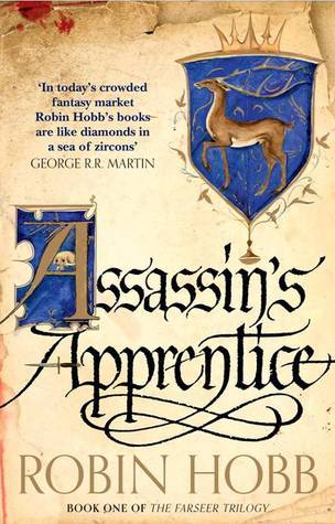

The left is the more recent UK edition, the right the US version, where the covers are metallic
They're both quite classy and mature covers belonging to the 21st century. So I order, thinking I'm getting the one on the right and instead I'm shipped this tragic thing, a relic of the past. Just no. Lesson learned, make absolutely sure that the text and the pictures agree and Amazon aren't teasing you with beautiful photos and you actually get some monstrosity from the 1990's.

The Photo Cover
I find that books with photos used on their covers have become way less common than they used to be. Now, we seem to be just getting past the sort of minimalist cover, which I'm quite a big fan of, but the only place I really see photo covers with any reliability is on romance books, something I don't often read. Photo covers are normally a bit hit-and-miss with me. On the one hand, the negatives:
- when the girl on the front is "supposed" to be the main character but looks nothing like her at all
- weirdly posed "sexy" women (think the selection books)
- creepy close-ups of faces such that it looks like the book is staring at you from your bedside table
On the plus side, some of my favourite childhood books had graphic covers and they can look quite good:

- weapons. someone on a book cover holding a real weapon looks cool af
- the Ranger's Apprentice covers have weapons, rad cloaks, horses, knights, the whole shebang
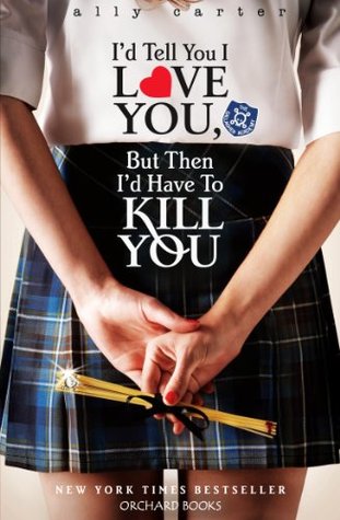
- co-ordinated series covers! I have the UK editions of the Gallagher Girls books and the whole set looks stunning together
The Arty Cover
As an alternative to the photo cover, we have the artsy cover. Maybe it's a drawn picture, or a minimalist design, or a fully rendered artistic vision, these covers have the potential to be amazing or downright offensive to the eye. Let's start with an example of the latter, shall we? Let's talk about Warcross. I didn't actually find the main cover, pictured below, too bad. Yeah, it's no vision, but it does sort of capture the sense of the book, and hey, no worries, if I don't like it in person I can simply take off the jacket, which is what I do with most of my hardbacks anyway. Oh my sweet summer child. Underneath this middling hardback jacket design is an explosion of rainbow that is eye-burning. Do yourself a favour, just don't look.


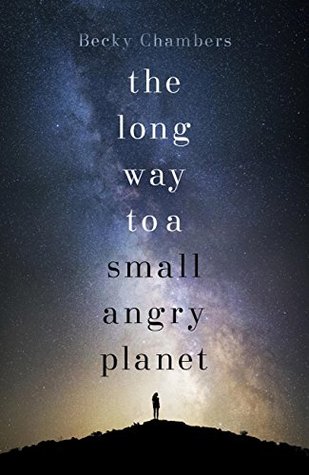
But some of the best covers I have ever owned are drawings/graphic design. Marie Brennan's A Natural History of Dragons series is not only an absolutely amazing read (10/10 for dragons & badass ladies) but the covers are divine, and work together so well. They're like anatomical sketches of different kinds of dragon and there's even more inside. Likewise, there's Becky Chambers' the long way to a small, angry planet (10/10 space read) which looks stunning in person, so many colours and sparkle and a sense of the great infinity of space. Damn.
No comments:
Post a Comment